
Why should I trust you 🤖?
传统的机器学习工作流程主要集中在模型训练和优化上; 最好的模型通常是通过像精度或者错误这样的性能度量来选择的,而且如果它通过了这些性能标准的某些阈值,我们倾向于假设一个模型是足够好的。在机器学习的许多应用中,用户会使用一个模型来帮助做决定, 例如:一位医生不会对病人进行手术,仅仅因为这个模型说不应该进行手术?
由于复杂的机器学习模型本质上是黑盒子,而且太复杂,机器学习模型做出的分类决定通常很难被人类的大脑所理解,但是能够理解和解释这些模型对于提高模型质量,提高信任度和透明度以及减少偏见非常重要,因为人类往往具有良好的直觉和因果推理,这些都是难以在数据评估指标中捕获。
因此,我们希望能够形象的理解它们的工作原理:为什么一个模型将具有特定标签的案例进行准确分类。eg: 为什么一个乳腺肿块样本被归类为“恶性”而不是“良性,仅仅因为它长得丑吗?
Local Interpretable Model-Agnostic Explanations (LIME) is an attempt to make these complex models at least partly understandable. The method has been published in “Why Should I Trust You?” Explaining the Predictions of Any Classifier. By Marco Tulio Ribeiro, Sameer Singh and Carlos Guestrin from the University of Washington in Seattle
How LIME works
lime is able to explain all models for which we can obtain prediction probabilities (in R, that is every model that works with predict(type = “prob”)). It makes use of the fact that linear models are easy to explain because they are based on linear relationships between features and class labels: The complex model function is approximated by locally fitting linear models to permutations of the original training set.On each permutation, a linear model is being fit and weights are given so that incorrect classification of instances that are more similar to the original data are penalized (positive weights support a decision, negative weights contradict them). This will give an approximation of how much (and in which way) each feature contributed to a decision made by the model
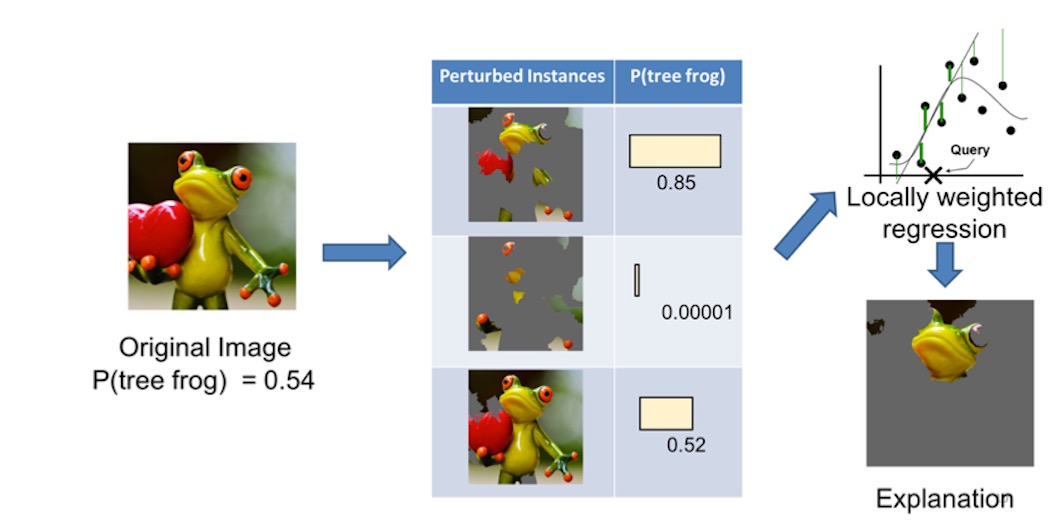
We take the image on the left and divide it into interpretable components

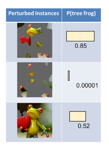
we then generate a data set of perturbed instances by turning some of the interpretable components “off”. For each perturbed instance, we get the probability that a tree frog is in the image according to the model.
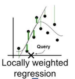
We then learn a simple (linear) model on this data set, which is locally weighted—that is, we care more about making mistakes in perturbed instances that are more similar to the original image
the end, we present the superpixels with highest positive weights as an explanation, graying out everything else
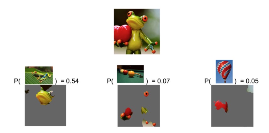
🤖预测这张图是个树蛙是因为这个部分,所以🤖预测结果是比较可信的。 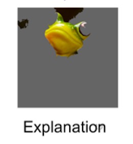
🤖预测这张图是台球是根据这些部分,所以🤖预测结果是不可信的。 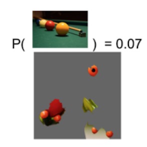
Example in R
01.Prepare the breast cancer data
This data of example comes from the book of R in action
loc <- "http://archive.ics.uci.edu/ml/machine-learning-databases/"
ds  <- "breast-cancer-wisconsin/breast-cancer-wisconsin.data"
url <- paste(loc, ds, sep="")

breast <- read.table(url, sep=",", header=FALSE, na.strings="?")
names(breast) <- c("ID", "clumpThickness", "sizeUniformity",
                   "shapeUniformity", "maginalAdhesion",
                   "singleEpithelialCellSize", "bareNuclei",
                   "blandChromatin", "normalNucleoli", "mitosis", "class")

df <- breast[-1]
df$class <- factor(df$class, levels=c(2,4),
                   labels=c("benign", "malignant"))

set.seed(1234)
train <- sample(nrow(df), 0.7*nrow(df))
df.train <- df[train,]
df.validate <- df[-train,]
table(df.train$class)
##
## benign malignant
## 329 160table(df.validate$class)##
## benign malignant
## 129 8102 Create decision tree model
library(rpart)
set.seed(1234)
dtree <- rpart(class ~ ., data=df.train, method="class",
               parms=list(split="information"))
dtree$cptable
## CP nsplit rel error xerror xstd
## 1 0.800000 0 1.00000 1.00000 0.06484605
## 2 0.046875 1 0.20000 0.30625 0.04150018
## 3 0.012500 3 0.10625 0.20625 0.03467089
## 4 0.010000 4 0.09375 0.18125 0.03264401plotcp(dtree)
dtree.pruned <- prune(dtree, cp=.0125)03 predict
dtree.pred <- predict(dtree.pruned, df.validate, type="class")
(dtree.perf <- table(df.validate$class, dtree.pred,
                    dnn=c("Actual", "Predicted")))
## Predicted
## Actual benign malignant
## benign 122 7
## malignant 2 7904 plot decision tree
#plot01
library(rpart.plot)
prp(dtree.pruned, type = 2, extra = 104,
    fallen.leaves = TRUE, main="Decision Tree")
#plot02
library(partykit)
library(dplyr)
dtree.pruned %>% as.party() %>% plot()
LIME: why should I trust you 🤖?
library(lime)
explainer <- lime(df.train, model = dtree.pruned)

# Explain new observation
#[model_type](https://github.com/thomasp85/lime/blob/master/R/models.R)
model_type.rpart <- function(x, ...) 'classification'#defined model_type method
test.data <-
  df.validate %>%
  dplyr::select(-class) %>%
  head(3)
explanation <- lime::explain(test.data, explainer, n_labels = 1, n_features = 2)

# The output is provided in a consistent tabular format and includes the
# output from the model.
head(explanation)
## model_type case label label_prob model_r2 model_intercept
## 1 classification 3 benign 0.9933993 0.1809444 0.05042991
## 2 classification 3 benign 0.9933993 0.1809444 0.05042991
## 3 classification 4 malignant 0.9507042 0.1918642 0.54743276
## 4 classification 4 malignant 0.9507042 0.1918642 0.54743276
## 5 classification 5 benign 0.9933993 0.1924691 0.05378321
## 6 classification 5 benign 0.9933993 0.1924691 0.05378321
## model_prediction feature feature_value feature_weight
## 1 0.4637659 blandChromatin 3 -0.001977357
## 2 0.4637659 sizeUniformity 1 0.415313316
## 3 0.9524157 singleEpithelialCellSize 3 0.002885248
## 4 0.9524157 sizeUniformity 8 0.402097681
## 5 0.4712710 maginalAdhesion 3 -0.004533032
## 6 0.4712710 sizeUniformity 1 0.422020822
## feature_desc data
## 1 2 < blandChromatin <= 3 3, 1, 1, 1, 2, 2, 3, 1, 1
## 2 sizeUniformity <= 4 3, 1, 1, 1, 2, 2, 3, 1, 1
## 3 2 < singleEpithelialCellSize <= 4 6, 8, 8, 1, 3, 4, 3, 7, 1
## 4 4 < sizeUniformity 6, 8, 8, 1, 3, 4, 3, 7, 1
## 5 maginalAdhesion <= 3 4, 1, 1, 3, 2, 1, 3, 1, 1
## 6 sizeUniformity <= 4 4, 1, 1, 3, 2, 1, 3, 1, 1
## prediction
## 1 0.99339934, 0.00660066
## 2 0.99339934, 0.00660066
## 3 0.04929577, 0.95070423
## 4 0.04929577, 0.95070423
## 5 0.99339934, 0.00660066
## 6 0.99339934, 0.00660066# And can be visualised directly
plot_features(explanation)
